Scatter Plots
[1]:
import pandas as pd
import data_describe as dd
[2]:
from sklearn.datasets import load_diabetes
data = load_diabetes()
df = pd.DataFrame(data.data, columns=list(data.feature_names))
df['target'] = data.target
df.shape
[2]:
(442, 11)
[3]:
df.head(2)
[3]:
| age | sex | bmi | bp | s1 | s2 | s3 | s4 | s5 | s6 | target | |
|---|---|---|---|---|---|---|---|---|---|---|---|
| 0 | 0.038076 | 0.050680 | 0.061696 | 0.021872 | -0.044223 | -0.034821 | -0.043401 | -0.002592 | 0.019908 | -0.017646 | 151.0 |
| 1 | -0.001882 | -0.044642 | -0.051474 | -0.026328 | -0.008449 | -0.019163 | 0.074412 | -0.039493 | -0.068330 | -0.092204 | 75.0 |
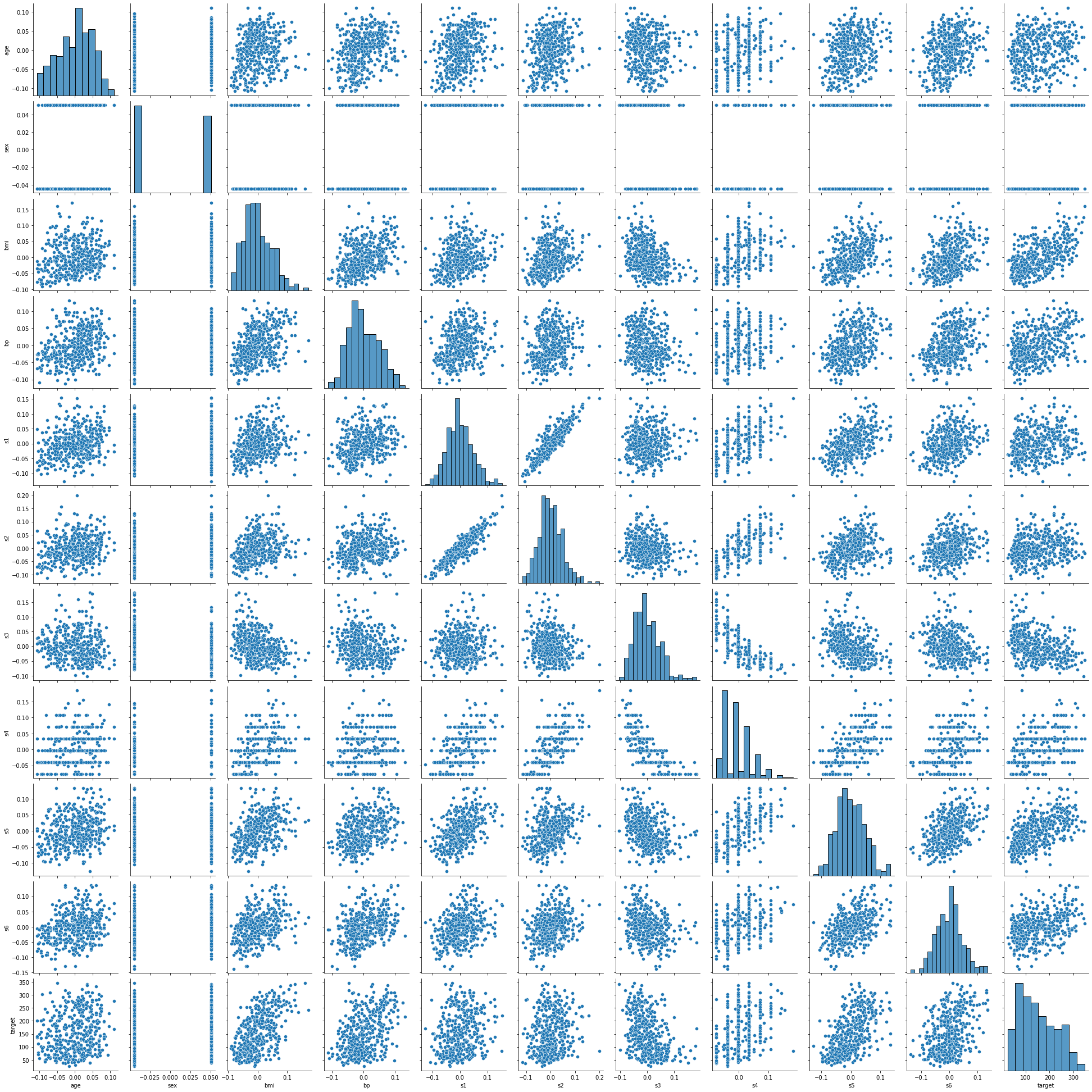
Scatterplot Matrix
[4]:
dd.scatter_plots(df, mode='matrix')
<seaborn.axisgrid.PairGrid at 0x21644629c88>
[4]:
data-describe Scatter Plot Widget
Show all plots
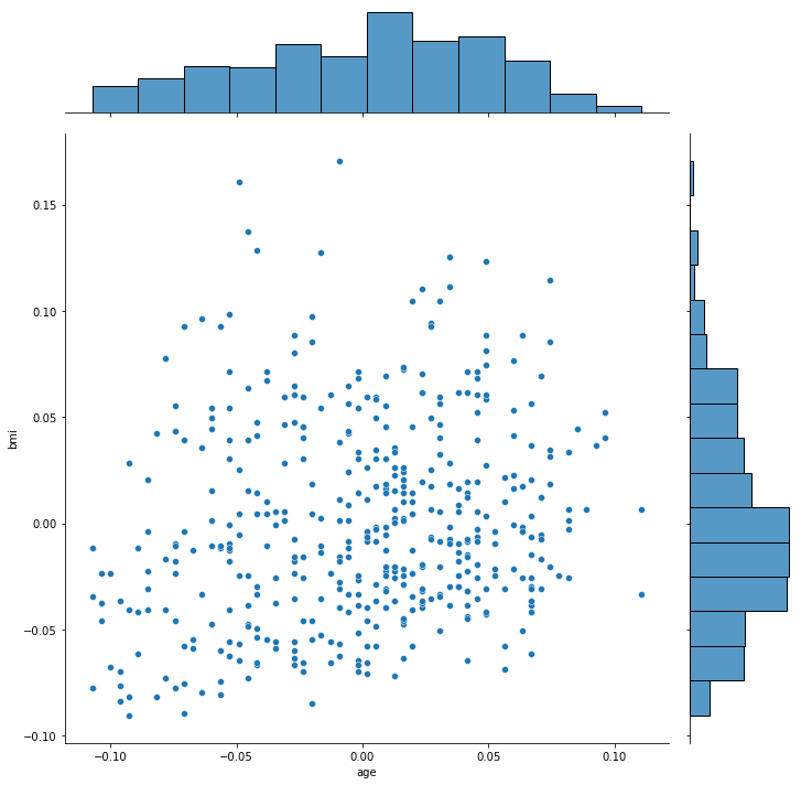
[5]:
df_subset = df.iloc[:, :3] # Avoid creating all the plots in this notebook
dd.scatter_plots(df_subset, mode='all')
[<seaborn.axisgrid.JointGrid at 0x216500e9848>,
 <seaborn.axisgrid.JointGrid at 0x216515810c8>,
 <seaborn.axisgrid.JointGrid at 0x2165165ad48>]
[5]:
data-describe Scatter Plot Widget

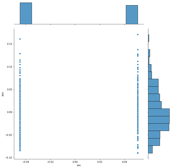
Show plots of interest using scatterplot diagnostics
Filter plots by a diagnostic
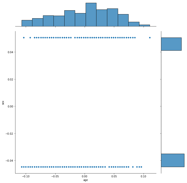
[6]:
dd.scatter_plots(df, mode='diagnostic', threshold={'Outlying': 0.5})
[<seaborn.axisgrid.JointGrid at 0x21651eabd48>]
[6]:
data-describe Scatter Plot Widget

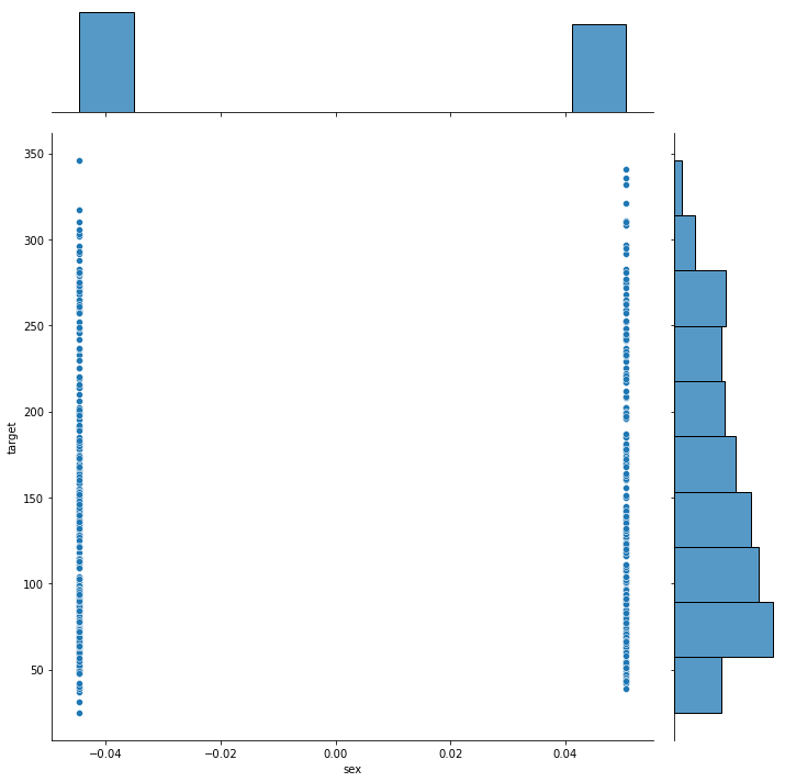
[7]:
dd.scatter_plots(df, mode='diagnostic', threshold={'Striated': 0.9})
[<seaborn.axisgrid.JointGrid at 0x216545ca108>,
 <seaborn.axisgrid.JointGrid at 0x21656a9ee08>]
[7]:
data-describe Scatter Plot Widget