Scatter Plots
[1]:
import pandas as pd
import data_describe as dd
UserWarning: The Dask Engine for Modin is experimental.
UserWarning: The extension "jupyterlab-plotly" was not found and is required for Plotly-based visualizations.
[2]:
from sklearn.datasets import load_diabetes
data = load_diabetes()
df = pd.DataFrame(data.data, columns=list(data.feature_names))
df['target'] = data.target
df.shape
[2]:
(442, 11)
[3]:
df.head(2)
[3]:
| age | sex | bmi | bp | s1 | s2 | s3 | s4 | s5 | s6 | target | |
|---|---|---|---|---|---|---|---|---|---|---|---|
| 0 | 0.038076 | 0.050680 | 0.061696 | 0.021872 | -0.044223 | -0.034821 | -0.043401 | -0.002592 | 0.019908 | -0.017646 | 151.0 |
| 1 | -0.001882 | -0.044642 | -0.051474 | -0.026328 | -0.008449 | -0.019163 | 0.074412 | -0.039493 | -0.068330 | -0.092204 | 75.0 |
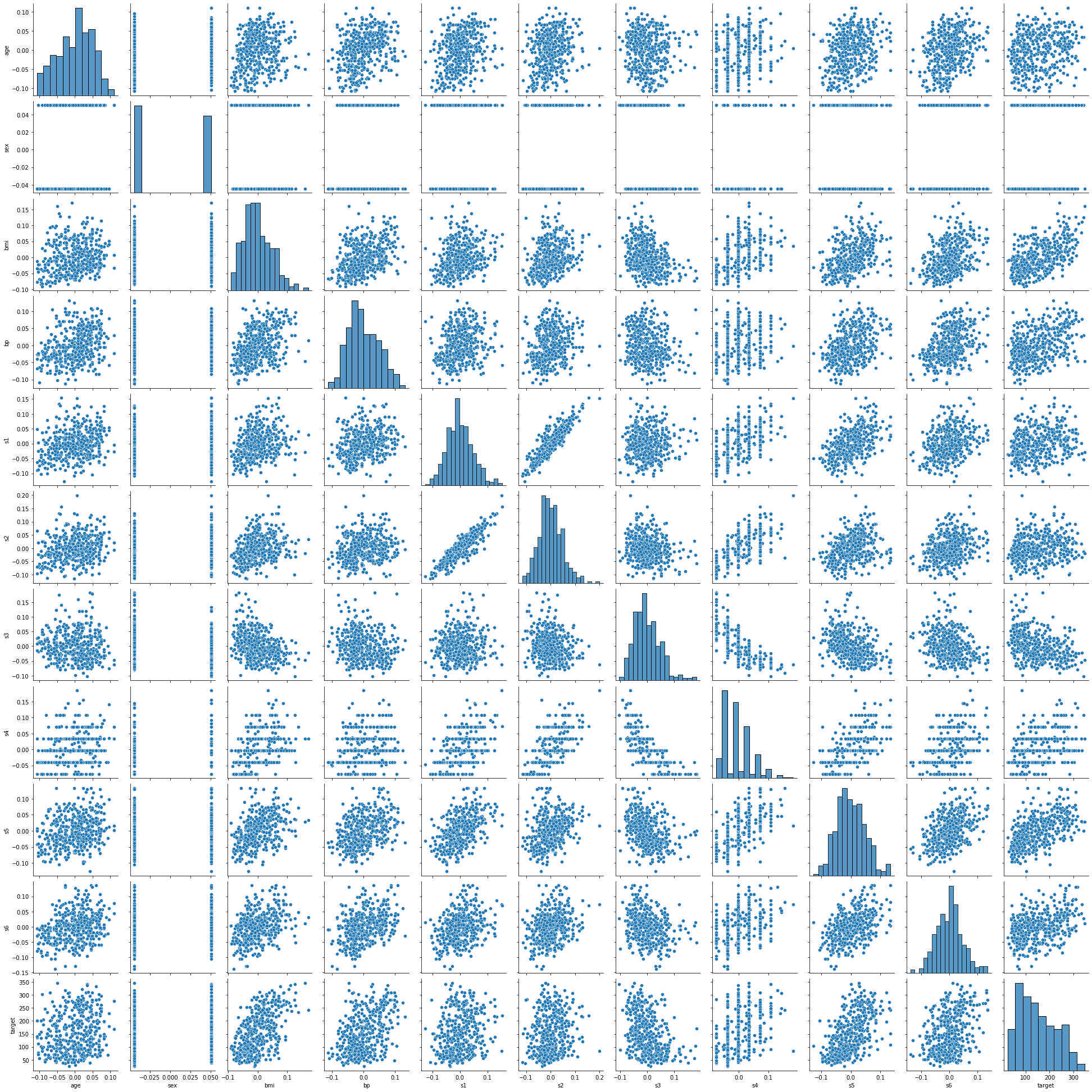
Scatterplot Matrix
[4]:
dd.scatter_plots(df, mode='matrix')
[4]:
<seaborn.axisgrid.PairGrid at 0x23b2f3bd6c8>
Show all plots
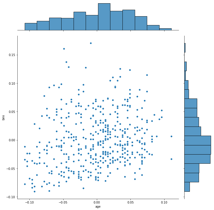
[9]:
df_subset = df.iloc[:, :3] # Avoid creating all the plots in this notebook
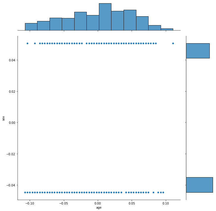
dd.scatter_plots(df_subset, mode='all')
[9]:
[<seaborn.axisgrid.JointGrid at 0x23b419380c8>,
 <seaborn.axisgrid.JointGrid at 0x23b441f40c8>,
 <seaborn.axisgrid.JointGrid at 0x23b4453a048>]

Show plots of interest using scatterplot diagnostics
Filter plots by a diagnostic
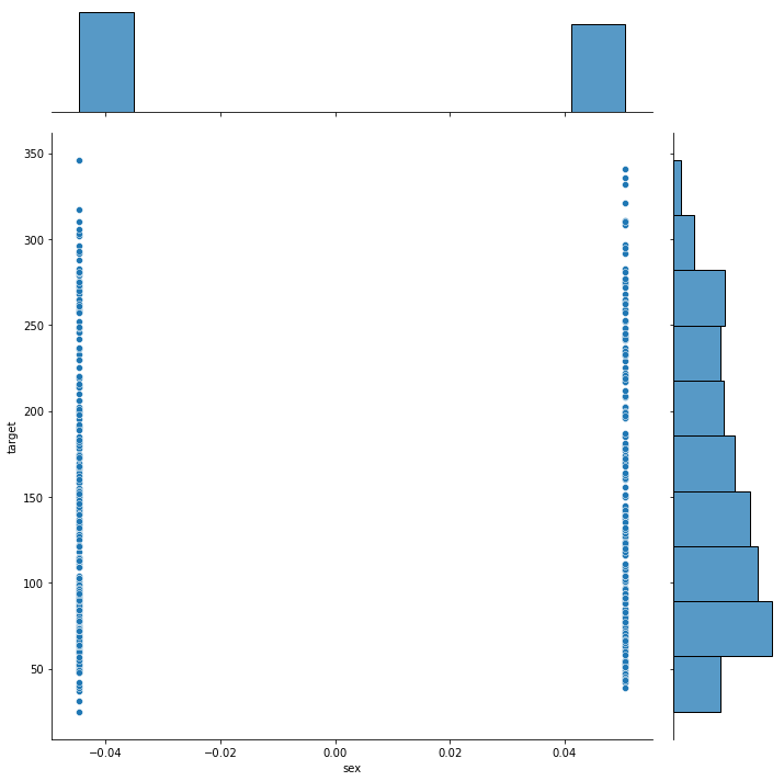
[6]:
dd.scatter_plots(df, mode='diagnostic', threshold={'Outlying': 0.5})
[6]:
[<seaborn.axisgrid.JointGrid at 0x23b3c76a548>]
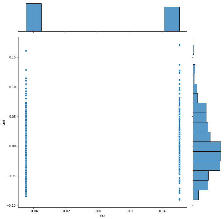
[7]:
dd.scatter_plots(df, mode='diagnostic', threshold={'Striated': 0.9})
[7]:
[<seaborn.axisgrid.JointGrid at 0x23b3ee14848>,
 <seaborn.axisgrid.JointGrid at 0x23b41338ec8>]